Galaxy G1 Trading Interface
Designing a dense institutional trading interface without hiding the work traders need to do.
A case study on a trading interface I led for four years to keep its complexity legible without flattening it, the calls that shaped it, and how it outlasted me.
Most software gets better as you remove things from it. Institutional trading software doesn't. A trader's decision depends on context held all at once: the pair, the spread, market depth, order type, balances, open orders, and what the market is doing this second. Take too much away and the interface is polite and useless. Leave it all on with no hierarchy and it becomes noise at the moment it most needs to protect attention.
Galaxy G1 made that tension unavoidable. The work was never about making a complex product look simple. It was about deciding, under real density and real risk, what an interface should make easy, what it should make deliberate, and what it should refuse to surface. That was four years of decisions. I led the design from 2020 to 2024, first as the solo Principal Product Designer, then leading a small design team. What follows is less a tour of the screens than an account of the calls the work required.
02
The decision underneath everything
A trading interface has to serve fast decisions and slow ones on the same screen, for the same person, sometimes seconds apart. Someone monitoring a few pairs is doing one job; someone working a large position into a thin market is doing another, and the screen can't pick a side and abandon the other.
So the question I kept returning to wasn't how to reduce complexity. It was sharper: where should the interface reward speed, where should it demand attention, and where should the trader, not the designer, decide how much friction the moment needs? Every part of the product got measured against that question. The rest of this is how it resolved across the surfaces that mattered most.
03
Building density into the foundation
Before a screen could carry that much, the system beneath it had to make density legible, and the first two years were as much about building that system as drawing screens. I built the product's visual language from the ground up and documented it. The test I held it to was simple: would it still hold the trading surface together as the product grew and as other people started designing on it?
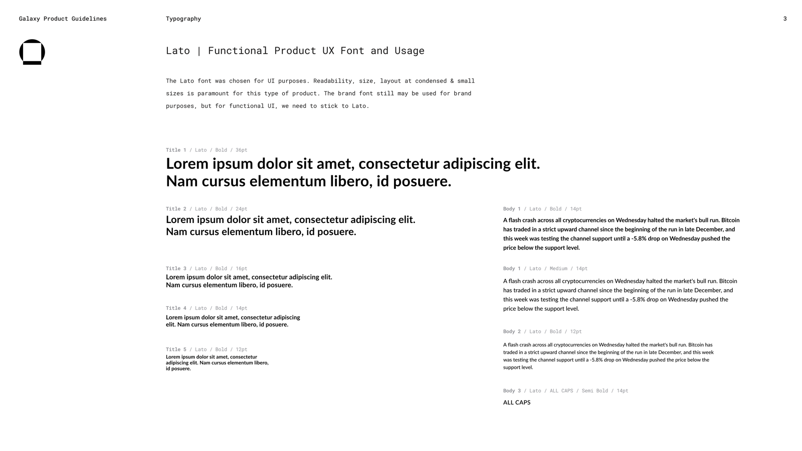
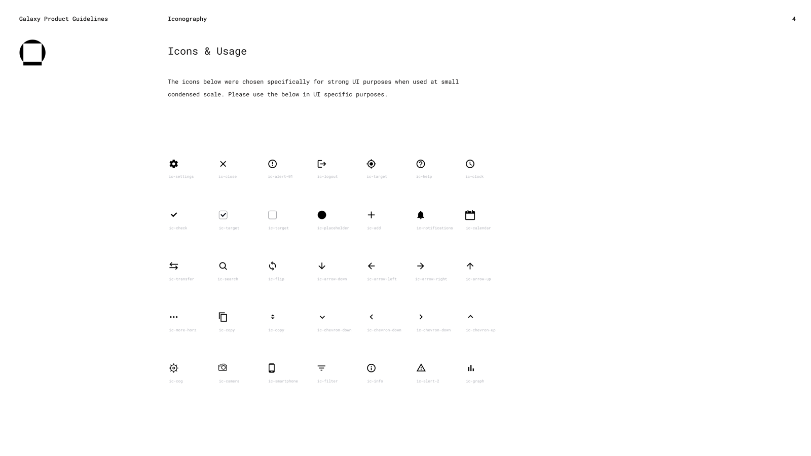
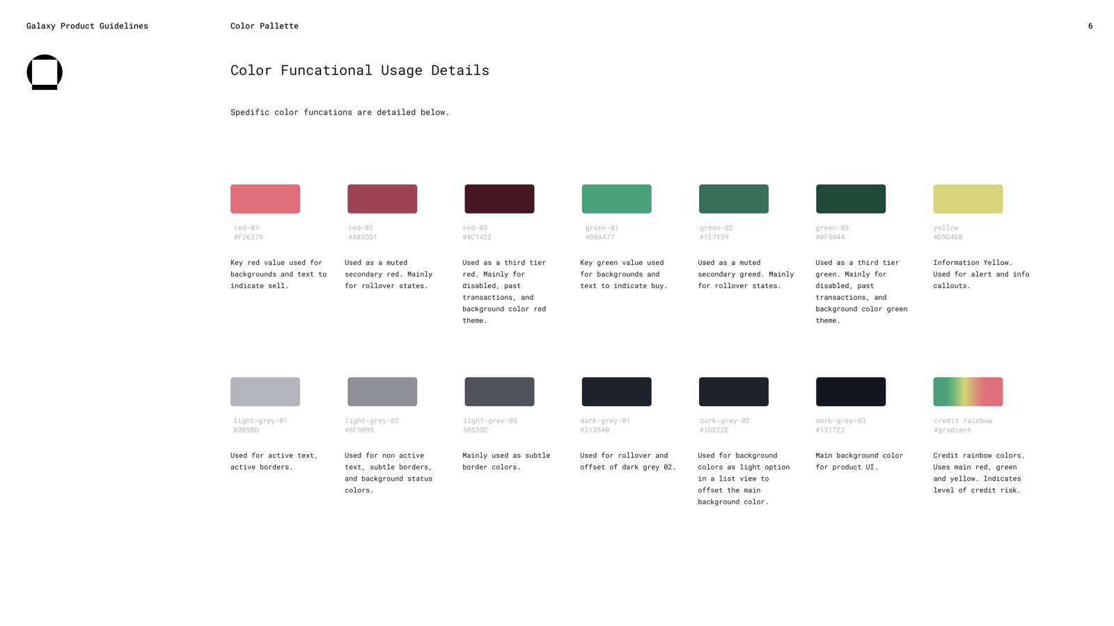
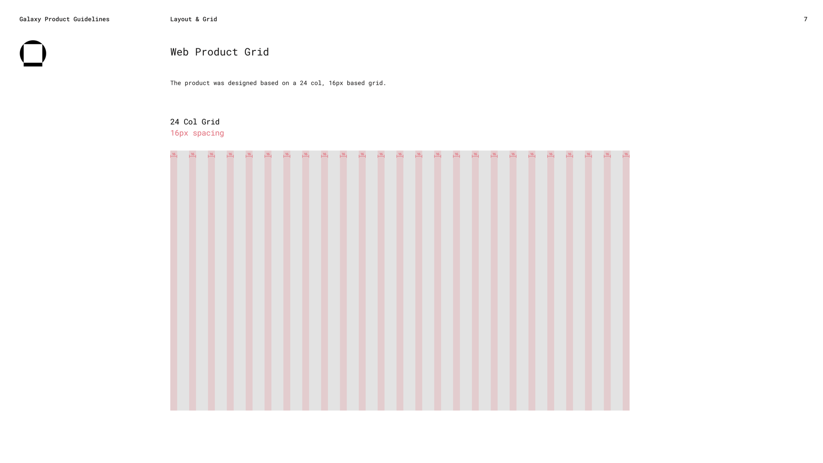
That's why none of it was generic. Color was functional: a dark palette with a slight purple cast for long sessions, red for sell, green for buy, greys for structure, and a credit-risk gradient for a domain signal that had to read at a glance. Typography served density: Lato as the UI face, tuned for the small text traders read for hours, with headings kept spare so body weights could survive in tables, pair cards, and tickets without making the screen loud. Iconography had to keep its meaning in tight rows, on dark backgrounds, at sizes where a stock set would have dissolved. The grid, twenty-four columns on sixteen-pixel spacing, had the resolution to place watchlist, chart, order book, ticket, balances, and open orders without forcing every panel to fight for room.
I built it as infrastructure rather than decoration for a specific reason. When the work moved from one designer to a team, the system let the next people extend the product without rediscovering the original logic every time. I was already designing for a group that didn't exist yet.
04
The calls on the surface
Traders move through the same loop all day: monitor, read context, read the execution detail, commit, review. Each step wants something different from the screen. The interesting work wasn't building separate tools for separate steps but deciding, surface by surface, how much each should help and how much it should get out of the way. Three of those calls did the most to shape the product.
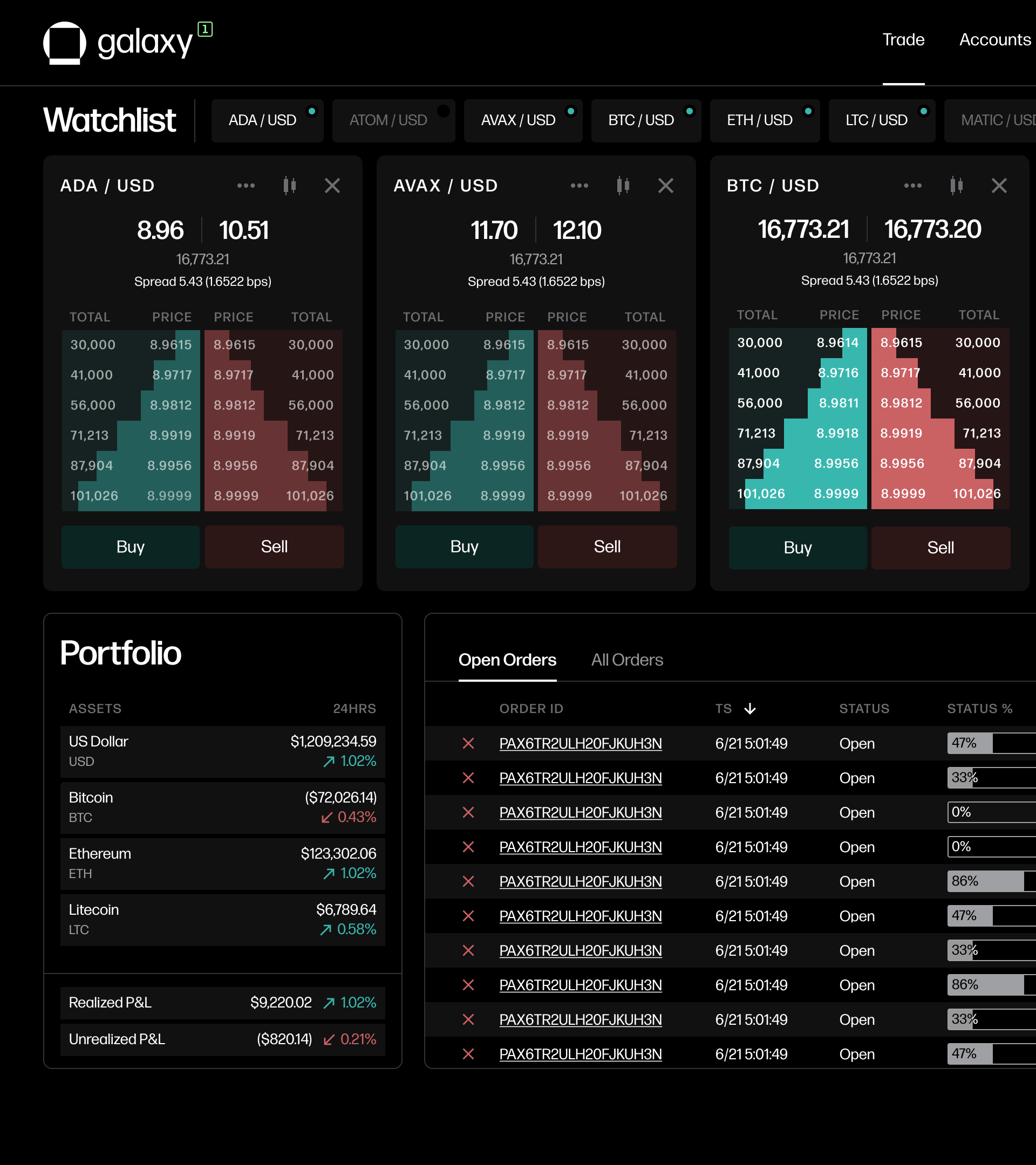
The watchlist was a working set
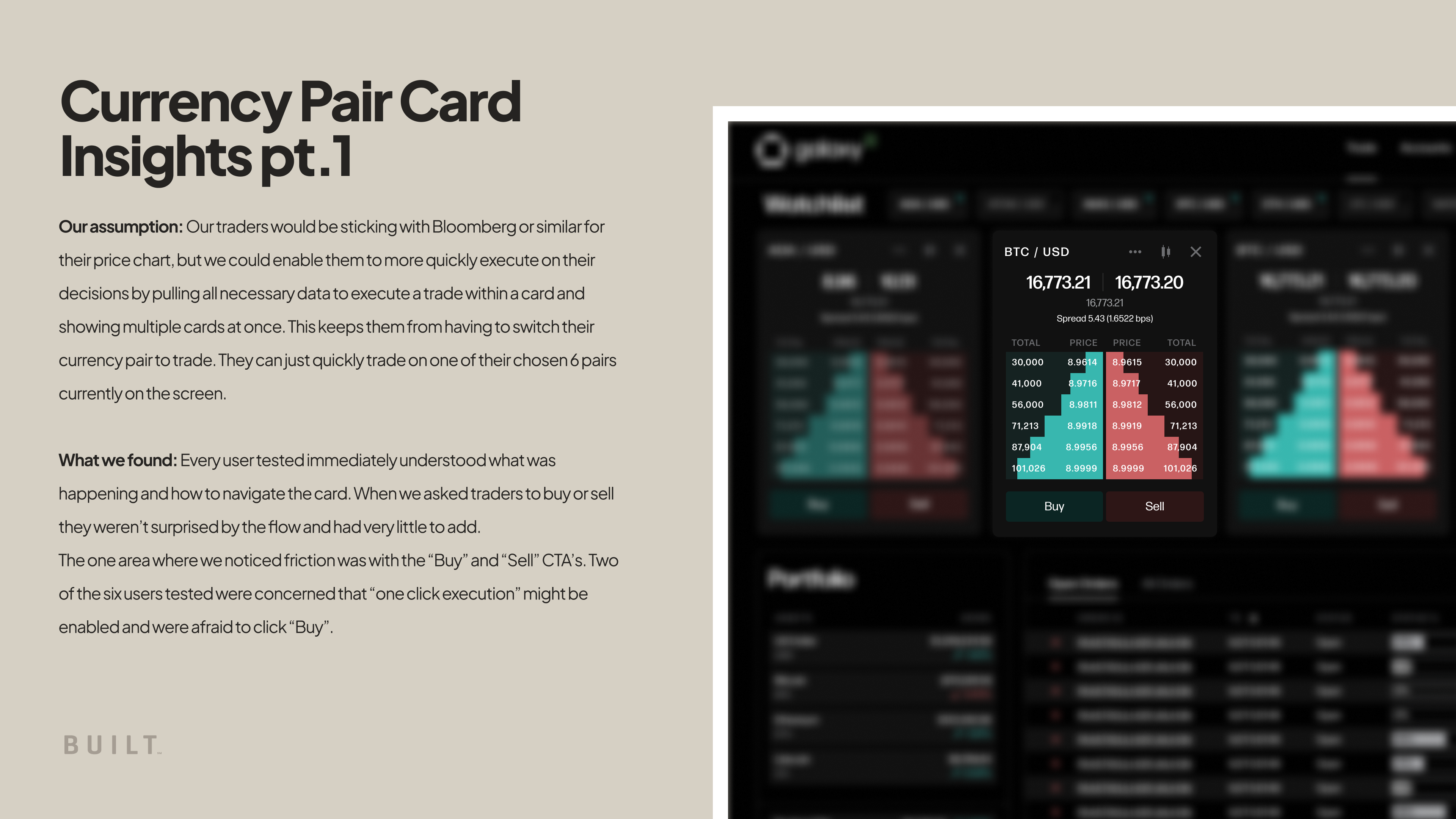
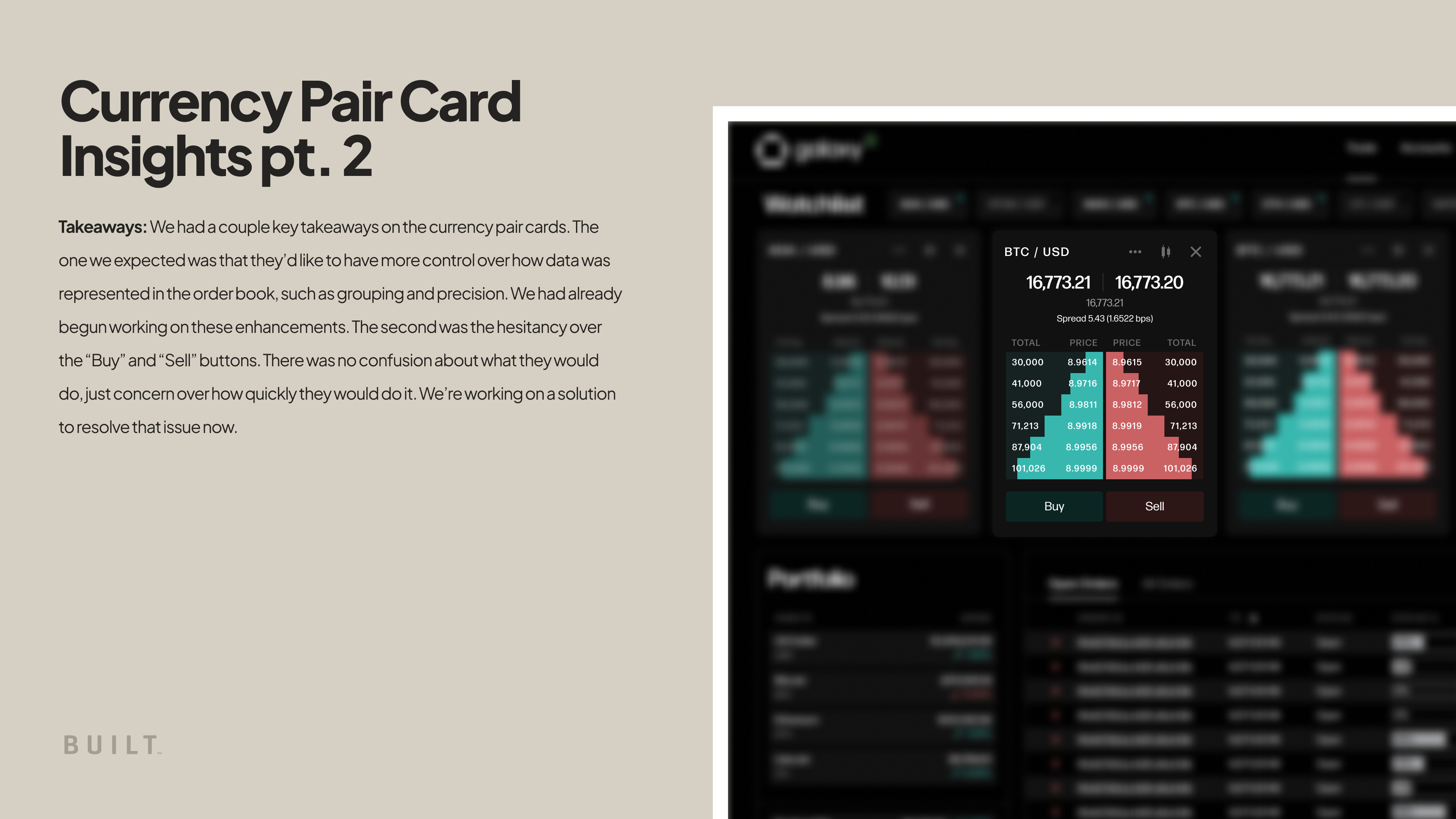
The watchlist looks like a list. It's really a commitment. Each pair gets a card carrying what an execution decision needs: spread, depth, recent price action, and the controls that open the trade. That density isn't optional, and it creates a hard limit, because only a few cards fit at once. I could have treated the watchlist as a searchable catalog of every tradable pair and let density degrade to make room. I chose the opposite: a working set, scoped to the pairs a trader expects to touch this session, with the card built as a decision surface rather than a preview. Testing backed the card itself, traders read it and navigated it cleanly, and it located the one place that still needed work. Some traders hesitated over whether tapping buy or sell placed a trade or opened the ticket. That hesitation was the useful result, because it marked the exact seam where monitoring had to become unmistakably distinct from execution.
The trade set the friction
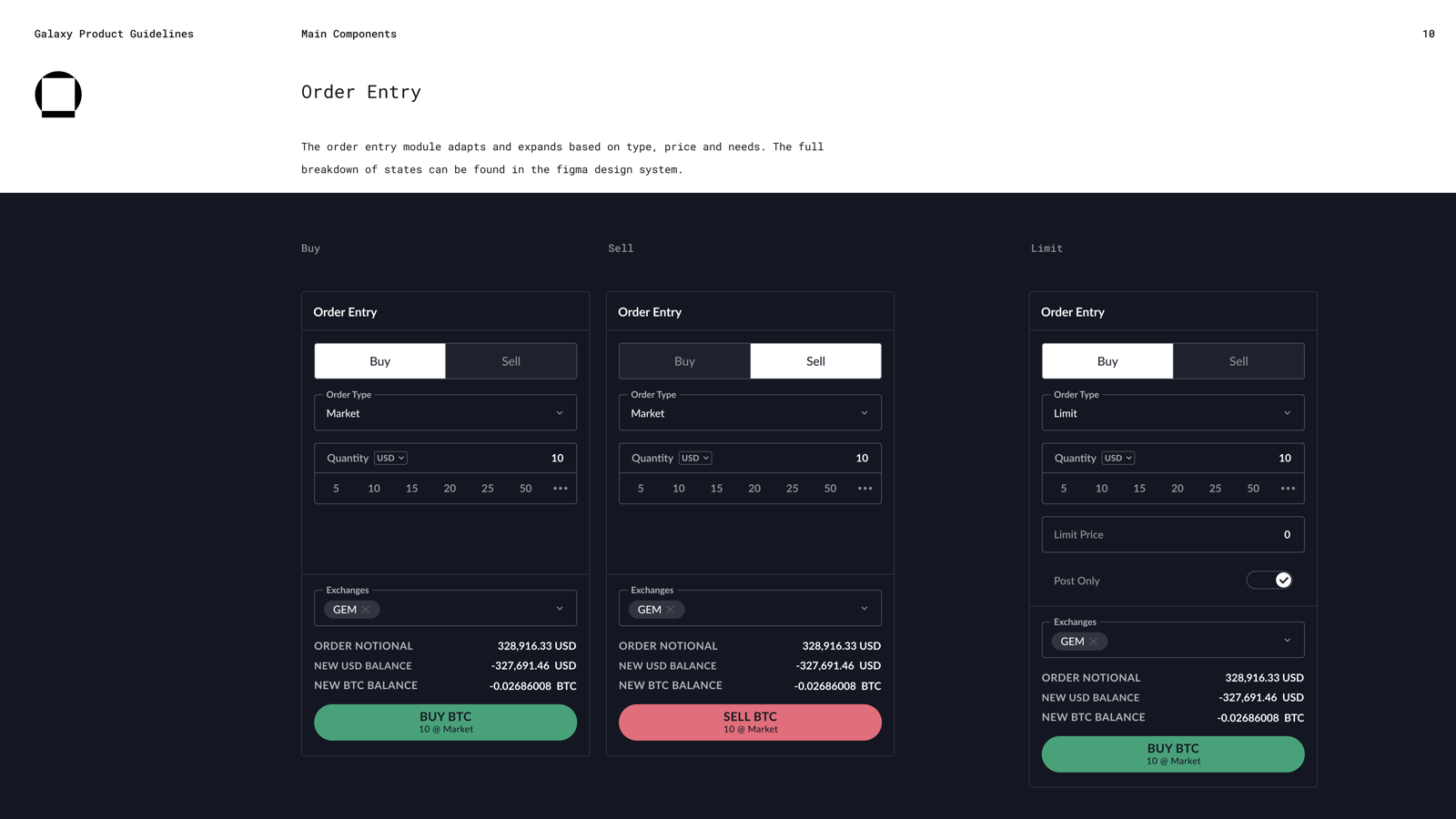
The order ticket is where the central tension became impossible to dodge. Some traders want it to anticipate them before they fill it in; others, working larger positions or thinner markets, want it to make them stop and read. The temptation was to design for one of them, and picking either would have failed the other, so I built the ticket to take its cue from the trade. It carries a trader from the card into a more deliberate state, order type, quantity, time in force, notional value, balance impact, and that state is prefilled and one action away for a fast trader while becoming a checkpoint for a careful one. The discipline was to stay responsive to intent while protecting the single moment that's hard to undo, the commitment, so the screen never slowed anyone past what the moment required or sped them past what they meant to do.
Supporting data stayed subordinate
A trader needs to know what they hold, what they owe, and what's still open, but none of it should compete with the trade in front of them. Balances had to give enough account context for responsible trading without sliding into portfolio analytics, and open orders had to show status, progress, and cancellation without becoming a workflow of their own. Restraint was the harder discipline here. The hard part is refusing to let supporting data demand equal attention, and then holding that line as the product grows and every stakeholder lobbies for their panel to be bigger.
05
What testing confirmed
In June 2023 we ran usability sessions on the core interactions, decision-making, execution, history, and managing pairs, with five traders and someone from the sales desk. The most useful finding was the undramatic one: nothing was fundamentally broken. The structure held and tasks completed, which meant the next round of work could be exact rather than speculative. Testing didn't redirect the product; it sharpened the same seams the decisions above had already exposed, the watchlist as a working set, the buy and sell commitment, the ticket's two speeds, more detail in balances. That's often the normal job of good research. It rarely hands you a hidden truth. More often it tells you where the work is holding, where a hesitation is doing useful work, and where the next pass needs to be more precise.
06
Building it so it would outlast me
G1 shipped. What mattered more was that it kept improving after it stopped needing me. As the product matured, I hired and led two designers who could carry it forward, and I built the system and the documentation so that carrying it never depended on me being in the room. After I left BUILT to start my own studio, I continued managing the Galaxy relationship, and one of the designers I brought onto G1 is shipping its latest iteration today.
That's the real test for a product like this, because it never stays finished. Markets move, trader needs sharpen, edge cases surface, and the interface has to keep evolving without losing the logic that made it usable in the first place. The system carried that logic. So did the research, and so did the framing around density, intent, and friction. What outlasted me was a way of deciding about the surface that other people could keep using after I was gone.
07
What this was, underneath the trading screen
Strip away the order books and the pairs, and the work was a series of judgments that most products with real stakes eventually need: preserve the complexity the expert needs, remove the ambiguity they don't, and stay careful about where the interface is allowed to demand attention. A trading terminal makes those judgments unusually visible. They show up just as much in a clinical tool, a logistics console, or an analytics product, anywhere someone is doing serious work and the easy move, hiding complexity to look clean, is the wrong one.
More work

Doorpass Turning a founder's smart-lock idea into a trust system for real estate access.
Simile Turning design intent into product behavior a team can build from.
If you're working on something with this shape, email me at drew@drewlittrell.com.